Art-Mecanica: Chris Chandler’s Innovative Experiments with Letterpress and Vintage Modular Type
By SHAWNA LIPTON
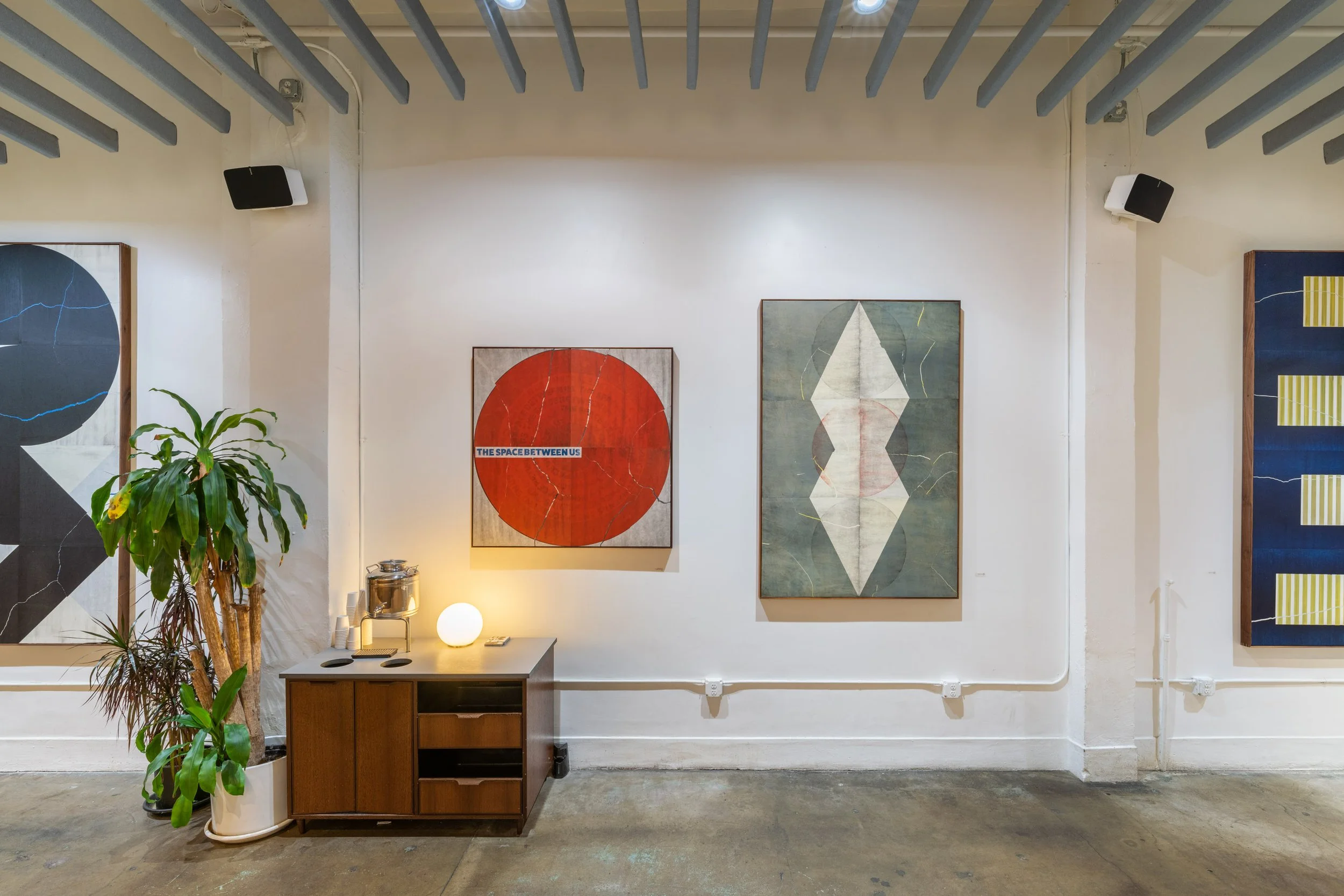
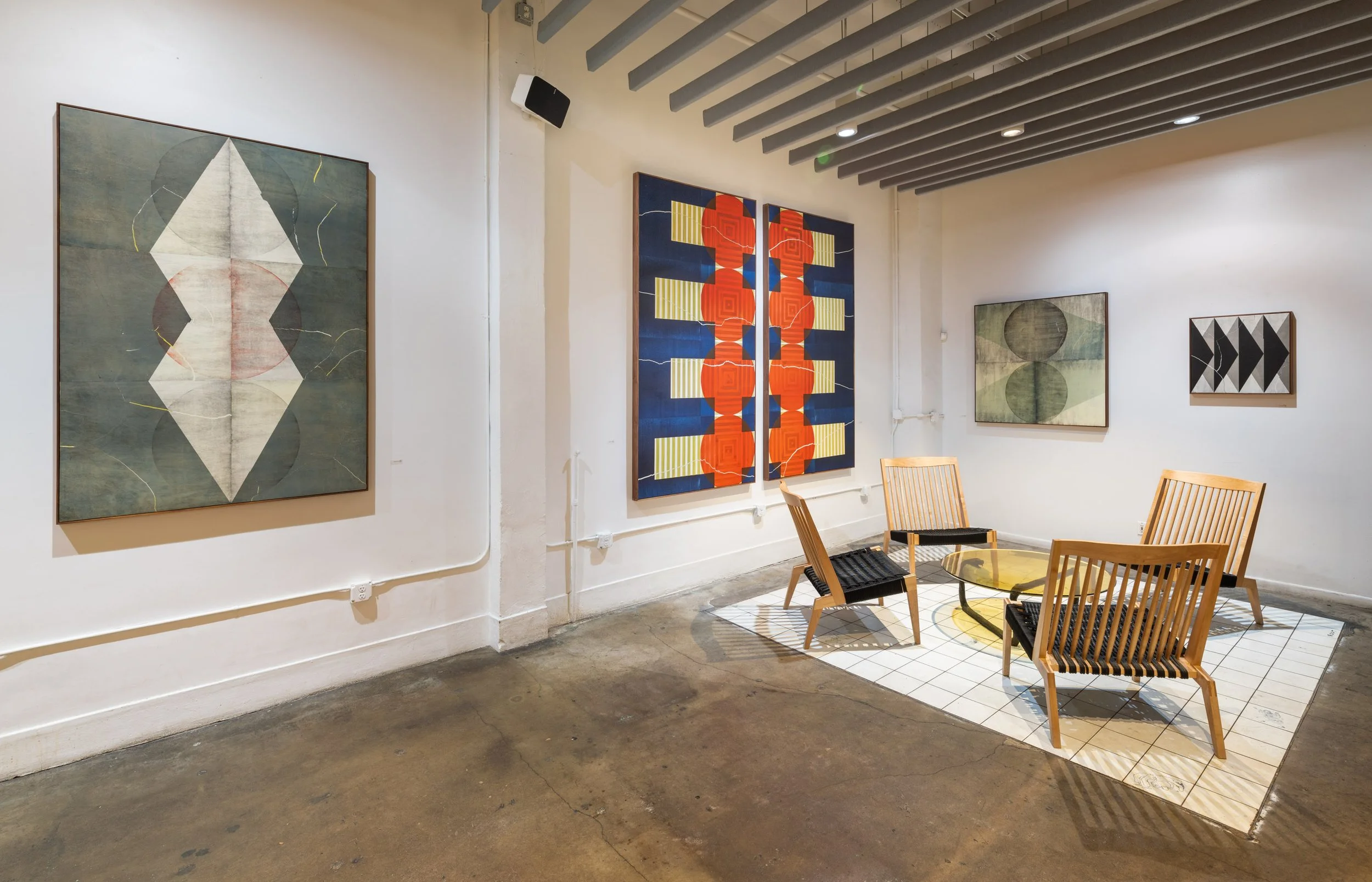
Chris Chandler, artist and founder of Portland-based letterpress studio Neu Haus Press, received a Stumptown Artist Fellowship with a companion exhibition currently on display at the Downtown Flagship location. Reimagined for Chandler’s Art-Mecanica, the cafe has some of its tables removed and the high walls painted ivory to showcase the large chromatic prints hung on the walls. Inspired by typography, Bauhaus design, and 20th-century avant-garde aesthetics, Chandler’s current body of work calls particular attention to the printmaking process. The functionally collaborative nature of his printmaking practice is facilitated by the tools he uses to create, namely, a Vandercook 232P letterpress machine, Alpha-Blox, and Futura Schmuck woodcut fonts.
Vandercook Presses were a popular form of proof presses in the 20th century. Vandercook's geared presses were more manageable and more precise for an operator to use at the time of their invention, representing efficiency and technological innovation. The show’s title, Art-Mecanica, is a nod to the mechanical device that enables the printing process, even though letterpress printing is now considered more of a labor of love than an efficient technological process. Chandler is insistently analog. His print practice centers on finding infinite variety and experimentation using a limited set of materials.
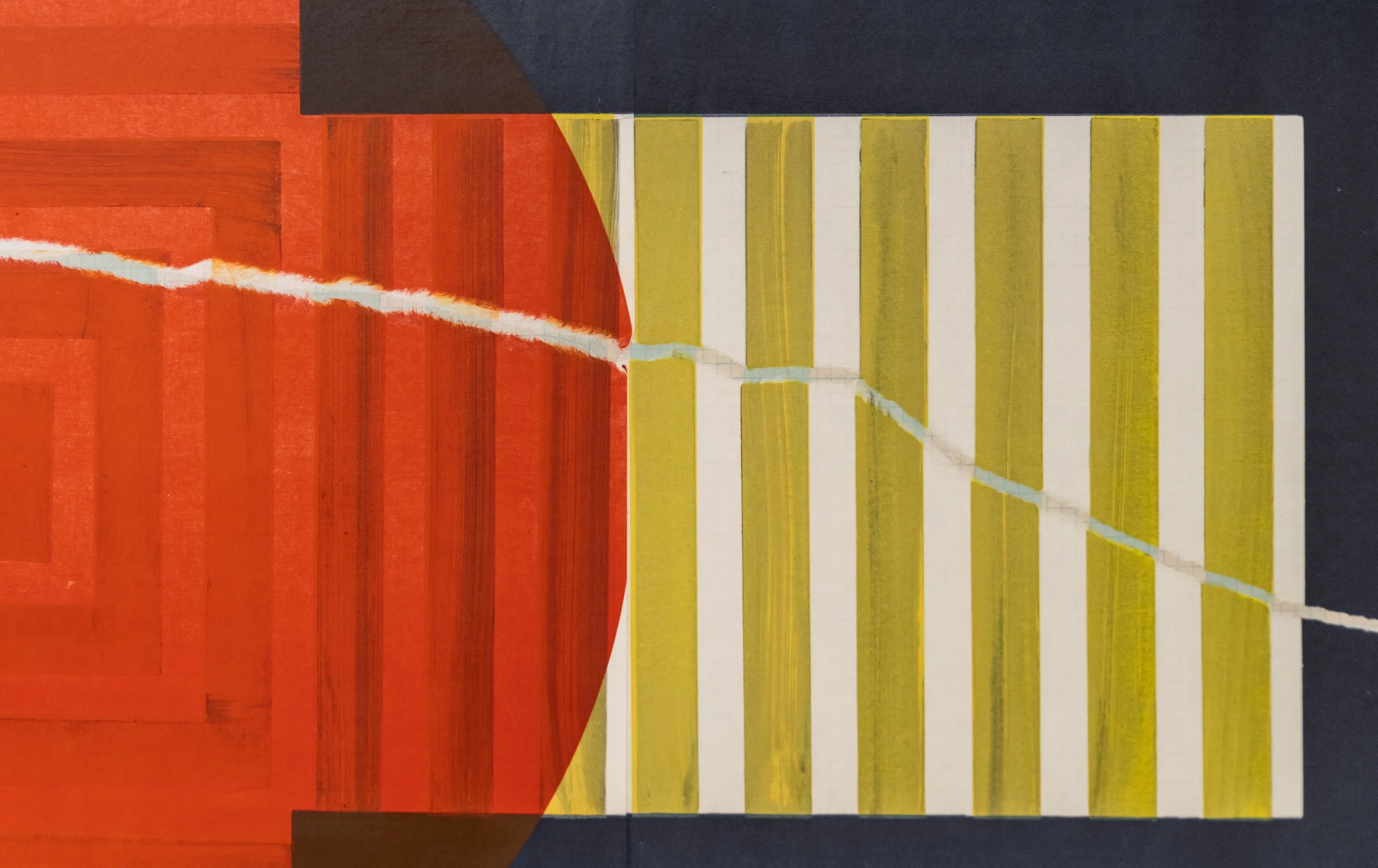
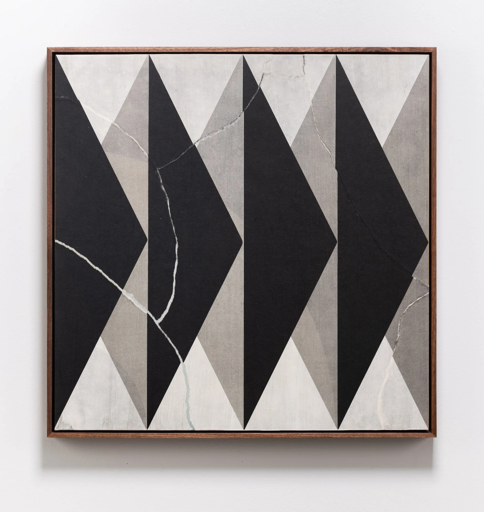
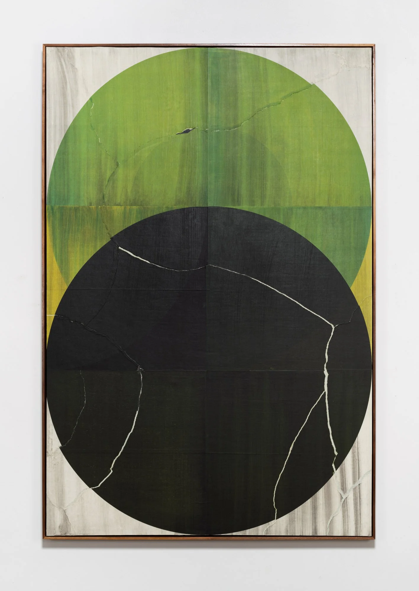
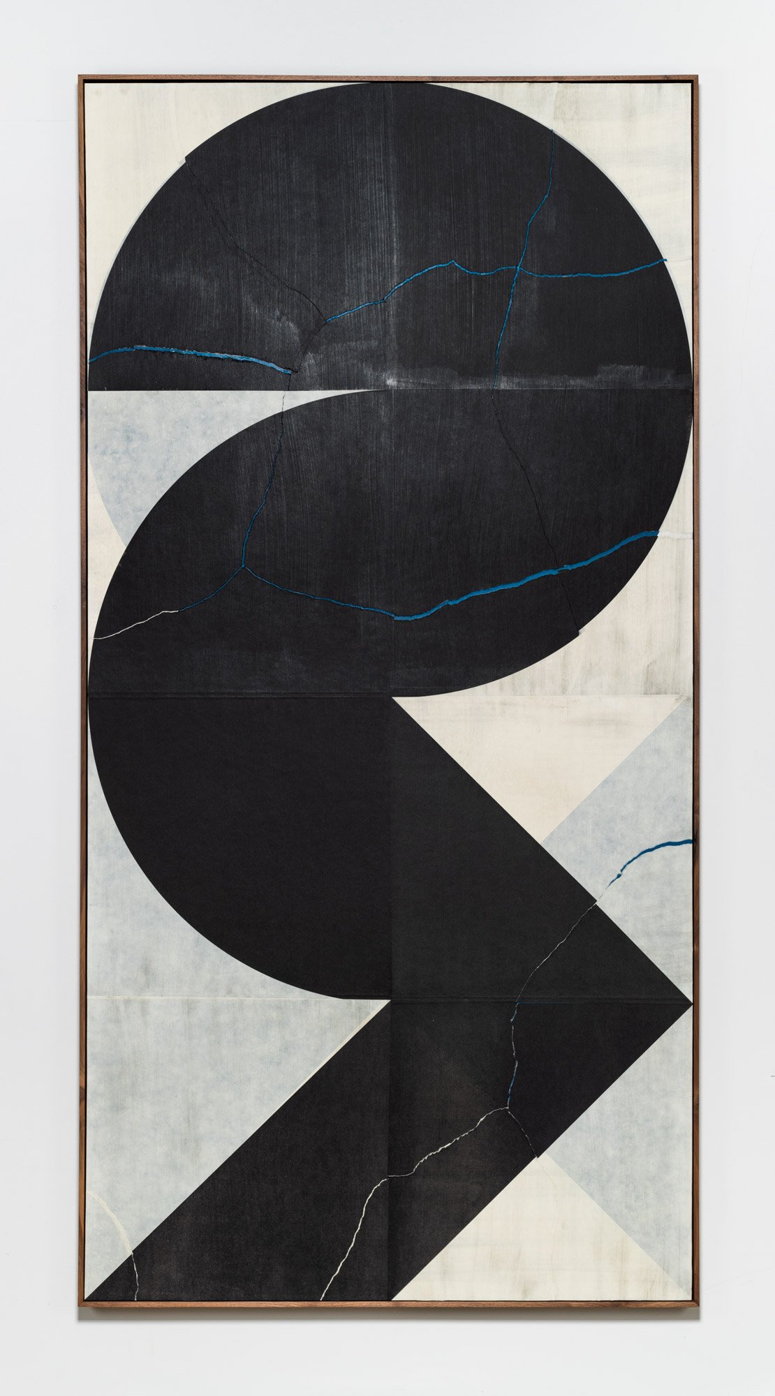
Fidelity to these building blocks and insistence on analog processes gives Chandler’s work distinctive character and form. Working with a limited set of materials and tools still provides plenty of room for experimentation with the letterpress, layering colors and patterns, constructing and deconstructing the modular type. This show plays with text as shape, blurring lines of legibility and abstraction. There is an iterative nature to the repeated graphic forms across large-scale prints, fadeouts, and diptychs in the show. Still, the slight imperfections, tears, and creases created from wheat pasting distress the prints, leaving a trace of the artist's hand, making each piece unique.
The work plays with setting and resetting modular typefaces, which are fonts that break down letters, borders, and decorative elements used for printing into parts. Futura Schmuck is a modern and geometric font composed of circles, triangles, and squares. It is a retro-futurist typeface that has lived up to its initial advertising as “the typeface of today and tomorrow” because it is still popular ninety years after its creation. Alpha-Blox is a modular type introduced by American Type Founders in 1944 that breaks the alphabet down into its most fundamental elements, lines, and curves. The font is highly impractical, requiring significant time and patience to assemble into legible lines of text, borders, and other typographic figures. For Chandler, the design and aesthetic of the Alpha-Blox offer seemingly endless combinations. Each of Chandler’s Alpha-Blox prints is named “AB,” with a number indicating the order that they were made. These generic and systematized titles point to Chandler’s emphasis on materials and process.
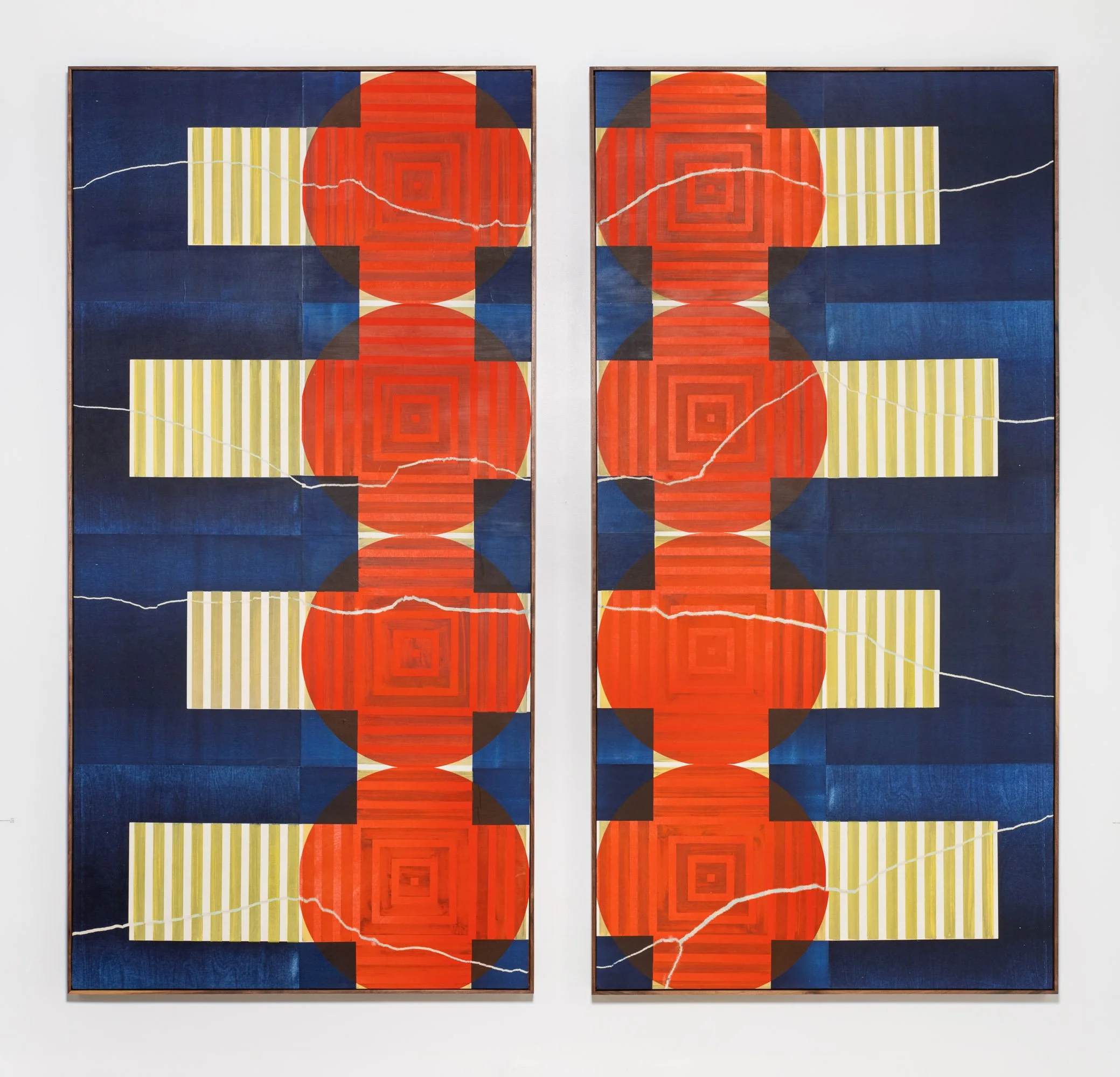
For this show, bright prints bookend the exhibition welcoming the viewer into the space and beckoning to a colorful red and blue diptych at the end. All but two of the works on display were created in the past year and feature bolder, more saturated colors than some of Chandler's earlier monochrome and grayscale works. “Fade Out: Blue Diptych” provides a spectrum of blue tones fading out in concentric semi-circles like the cycles of the moon. During the ongoing pandemic, the artist did not feel that anyone needed a further provocation to experience dark night of the soul. In this way, the show celebrates seeing art in public. These pieces feel like works you want to linger near, live, and work beside, appropriate for a communal gathering space.
As a body of work, there is cohesion to these pieces. One that stands out from the rest is a collaboration between Chandler and London rubber stamp artist Savvas Verdis. Rubber stamping is another print process and a different way to play with text as form. Every print in the show employs type, but Chandler’s solo works deconstruct and break down fonts into abstract shapes and patterns. This print features the words “The Space Between Us” against a bold red circular background. With social distancing, people have become profoundly aware of the space between bodies and their physical proximity to one another. The Space Between Us, 2021, represents how the two artists worked together without being in physical proximity due to the pandemic. The print creates a connection between the artists as collaborators and the viewers as readers.
Art-Mecanica has solid visual references to modern design, dramatic scale, and a scrappy approach to experimentation that leaves room for organic flaws and idiosyncrasies. Chris Chandler brings bold and innovative variations to the centuries-old art of letterpress printing.
Art-Mecanica is on view October 15th, 2021 - January 12th, 2022 at Stumptown Coffee Roasters Downtown, 128 SW 3rd Ave, Portland, OR.
Chris Chandler (he/him) founded Neu Haus Press in 1996 when he acquired his first Vandercook Press in Venice Beach, CA. His love, talent, knowledge, and collection of this vintage craft have grown through the years. From 30 years working as a tour manager and sound engineer for bands, he has had the privilege of sharing his passion for letterpress with musicians in collaboration with their artwork. Chris can expand his printing portfolio and create letterpress art by residing in Portland, OR with his wife and two children.
Shawna Lipton (she/they) is Academic Director of the Hallie Ford School of Graduate Studies at the Pacific Northwest College of Art. She received her Ph.D. in Literature and Cultural Theory from the University of Wisconsin-Milwaukee.
